We have started on the first painting of the class. It is a still life, to be done in oil.
To start off the painting, we first had to treat our canvases with a layer of acrylic gesso. I didn't take a picture of it because it probably wouldn't have shown up..............
This is where we began toning our canvases with burnt sienna and mineral oil. Since we're just getting a background tone, it didn't need to be neat; haphazardly was good enough. (I didn't even know mineral oil was a thing. I have a lot to learn about oil painting.)
Here we blocked in the main shapes from the still life. I took the bottom left corner of the set up, including the apples, books, and tea pot...can. We may had to have added a pretend apple here and there to better the flow of the picture.
Here we are beginning the refining of the shapes.
By the end of the class period, I had refined the main focal points. Once the rest is refined, we will probably start painting them in!
Here I started blocking in the colors. In class, we learn the technique of 'thick over thin', so we add dark tones in more opaque coats. I did not know what to do for the tea can so I messed around with the mineral spirits, which was a mistake because it came out very thin. After it dried more I had to cover it up with a thicker layer of paint. It is quite the learning experience, for I do not fully understand the consistency of oil paints and the purpose of mineral spirits.
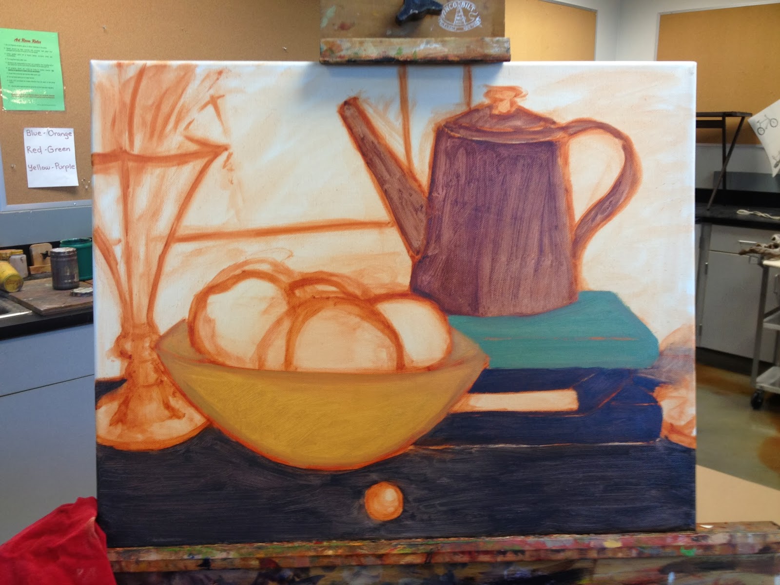
At this point, everything in the still life has been blocked in solid colors. I will soon begin the refining and shadows. Right now the paint is still pretty thin, because I still haven't learned my lesson about mineral spirits. In class we also focus on the process of applying darks first rather than midtones or lights. I have not completely understood that process, so I think I was probably working from midtones to darks to lights. So that brown on the tea kettle is probably the midtone rather than the dark.
The kettle is starting to take shape in form and value here. Again, I have not learned my lesson with the mineral spirits. I feel that I am fearful of going too thick with the paint, but I will have to learn nonetheless.
Also, here is a close-up of my snazzy purple cowboy!
In the weeks leading up to this shot, I had gotten a new phone and could not save specific process shots of the completed kettle, bowl, or apples. I will say though that I struggled with getting the right colors. The colors I mix are always too vibrant (as I feel with the apples), or too dull (the problem with the bowl before my instructor helped me). Something I had frequent problems with is making highlights, I think. I usually just kept adding white to the painting for highlights, but I knew that wasn't right. I mean, I knew it wasn't the right thing to do, but I just couldn't understand it too well, I suppose. So for the highlight on the apples, I learned to use white and a smidge of cadmium yellow. About a week or two later I went back and yellowed it up a bit more. For some reason I couldn't wrap my brain around the fact that white does not brighten, but it dulls.
The processes though, I will say, were much easier once I weaned myself off of the mineral spirits. It was at this moment in time that I had remembered that there was an apple on the right side of the canvas. Also, I had begun work on the silver vase on the left.

(I was told to add another cowboy behind the bowl. If only I were able to salvage the process pictures.) The vase was actually quite difficult. I could not get the right colors after a couple day's break, and I could not understand the reflections on the silver......Regardless, at this point I have gathered complete understanding of thick on thin, but not wet on wet technique. That was the main problem I had been having, because I work better with dry on wet instead. In other news, I got that apple in, as well as the background and foreground. I lost the process pictures because of my new phone, but it used to be a weird dark indigo color because I could not understand how to get the weird peachy-tan color that the light created on the black tablecloth. My favorite thing to paint though was the reflection under the orange marble.

Here is the complete finished piece. I wish so much that I had been able to save the various process shots I had taken, but alas, technology was not on my side with this.